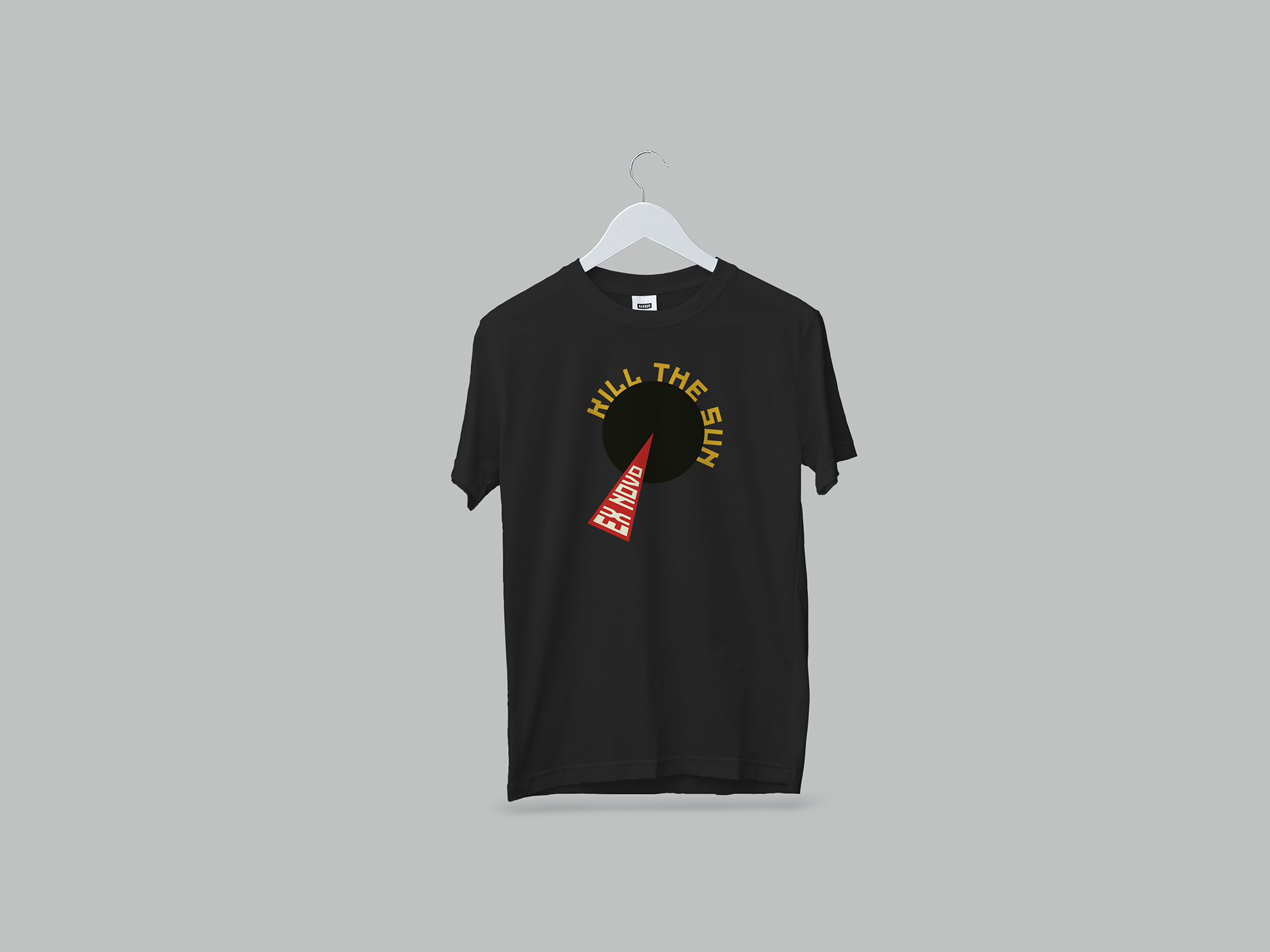


T-shirt with main design from label.

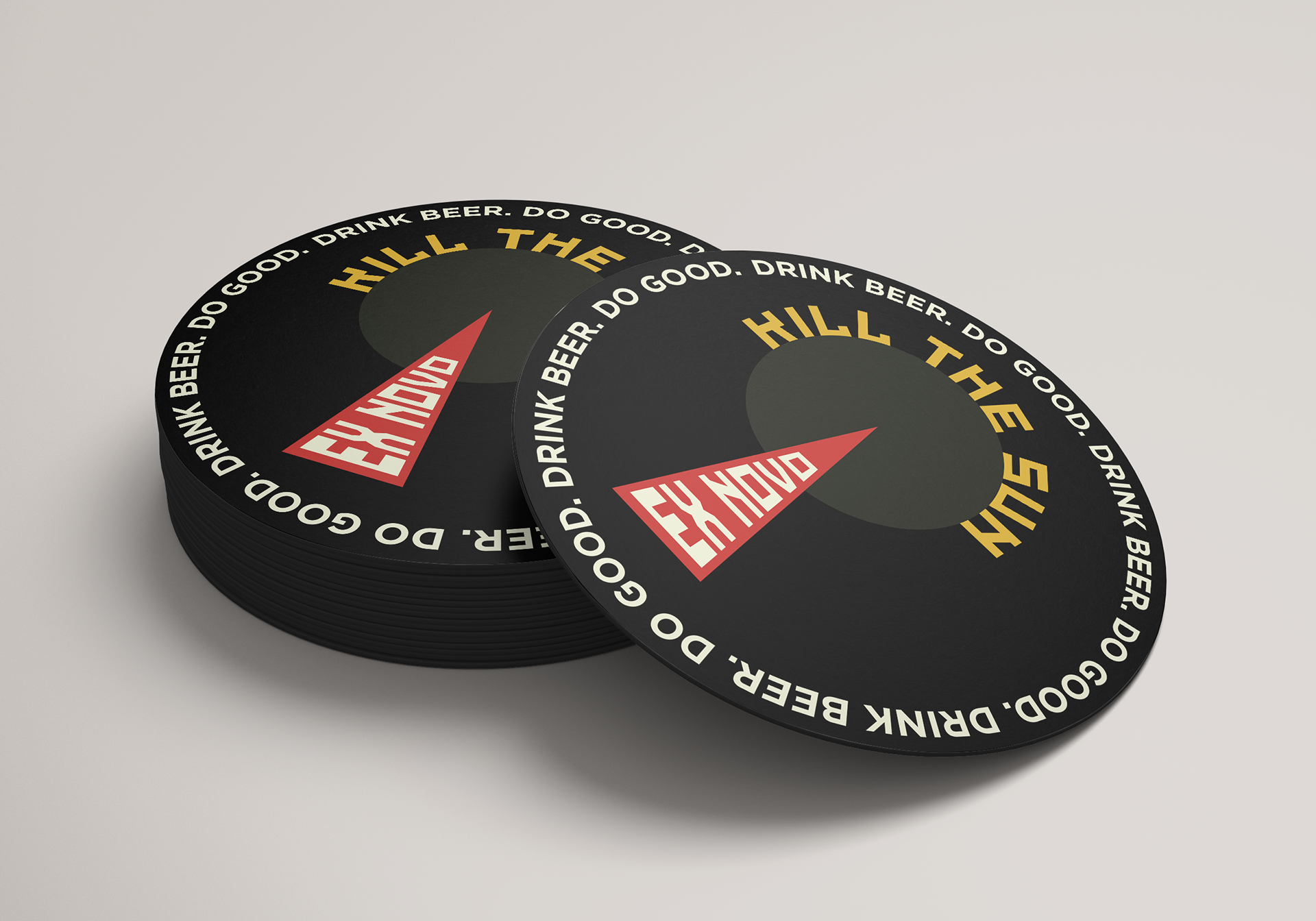
Coaster with main design from label and company's "Drink Beer. Do Good." slogan.

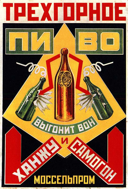
Alexander Rodchenko poster

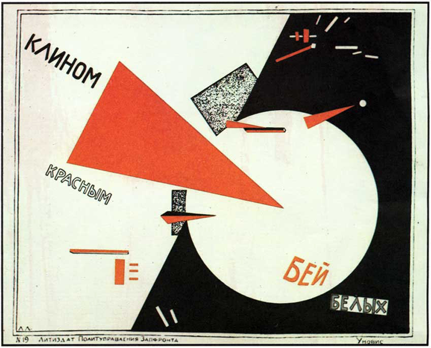
El Lissitzky poster

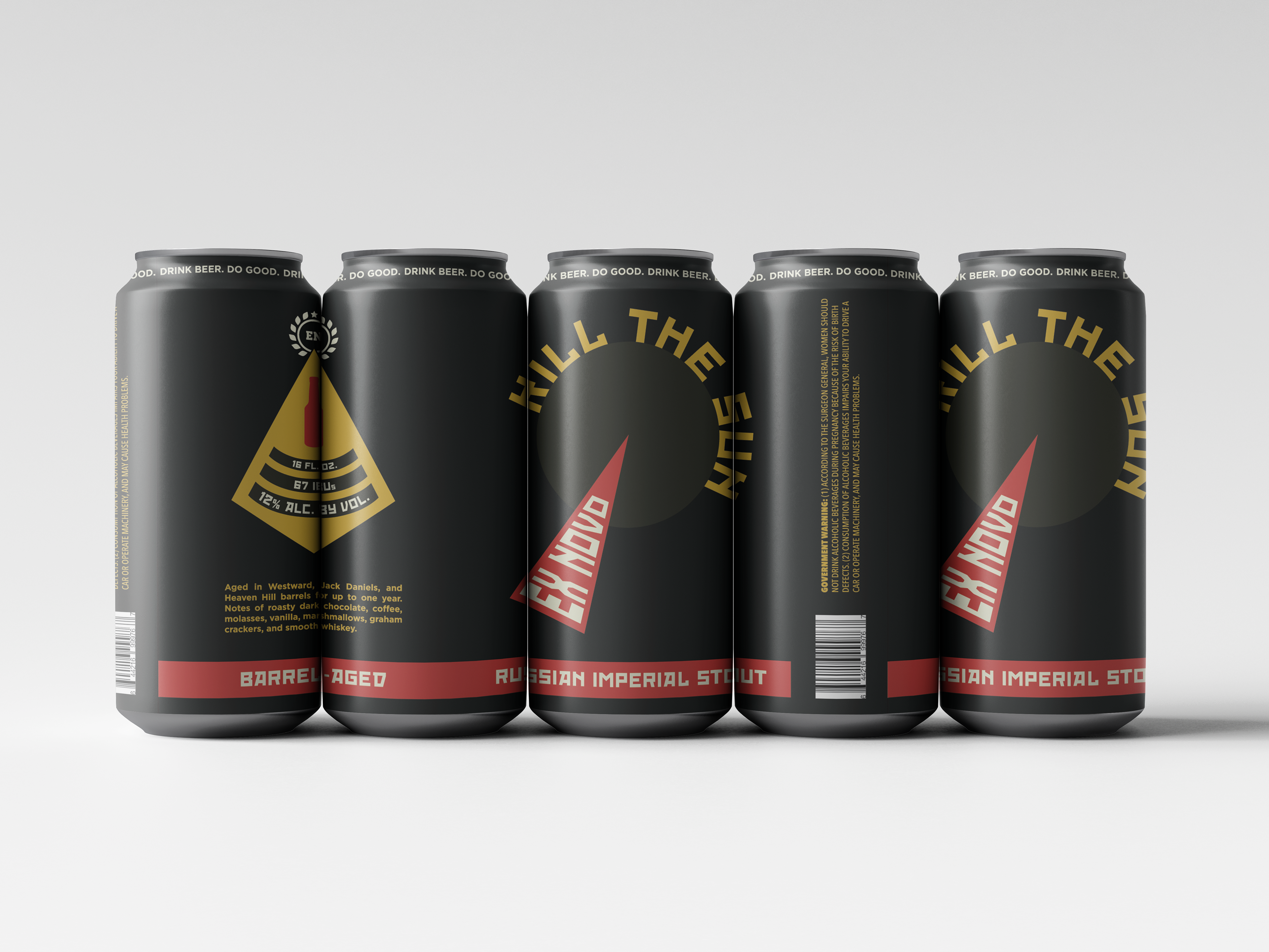
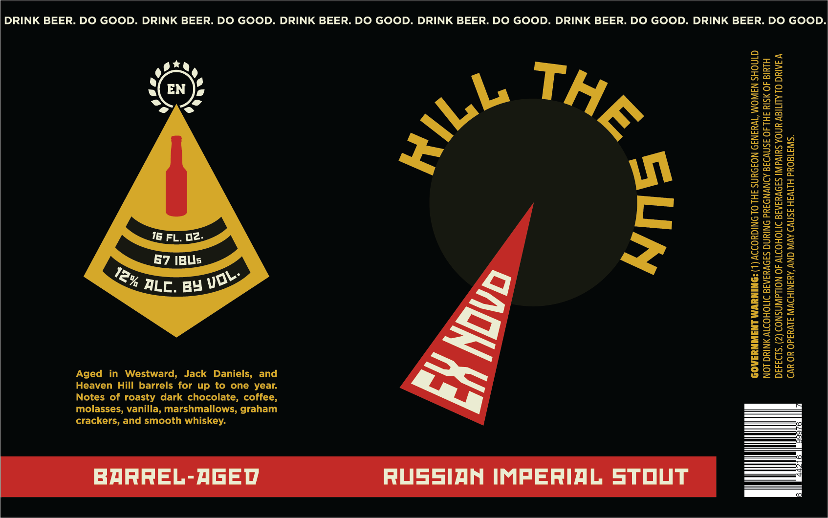
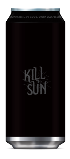
Featuring bright colors, flat geometric shapes, and a bold geometric typeface, this redesigned beer label and accompanying merchandise has a modern and abstract composition inspired by Constructivist poster designs. Taking a cue from El Lissitzky’s Beat the Whites with the Red Wedge, the design incorporates a red wedge piercing into a dark green circle with the name of the beer, “Kill The Sun”, curved around it. The red wedge abstractly symbolizes the darkening and killing of the sun, and provides an accompanying visual to the name of the beer. On the left side of the label, there is a large yellow geometric shape inspired by Alexander Rodchenko’s 1925 advertising poster Trekhgornoe Beer Will Drive Out Homebrew! The color palette of black, red, yellow, dark green, and white was chosen as another reference to Constructivist poster design, and in particular Rodchenko’s aforementioned advertising poster.
